Introduction:
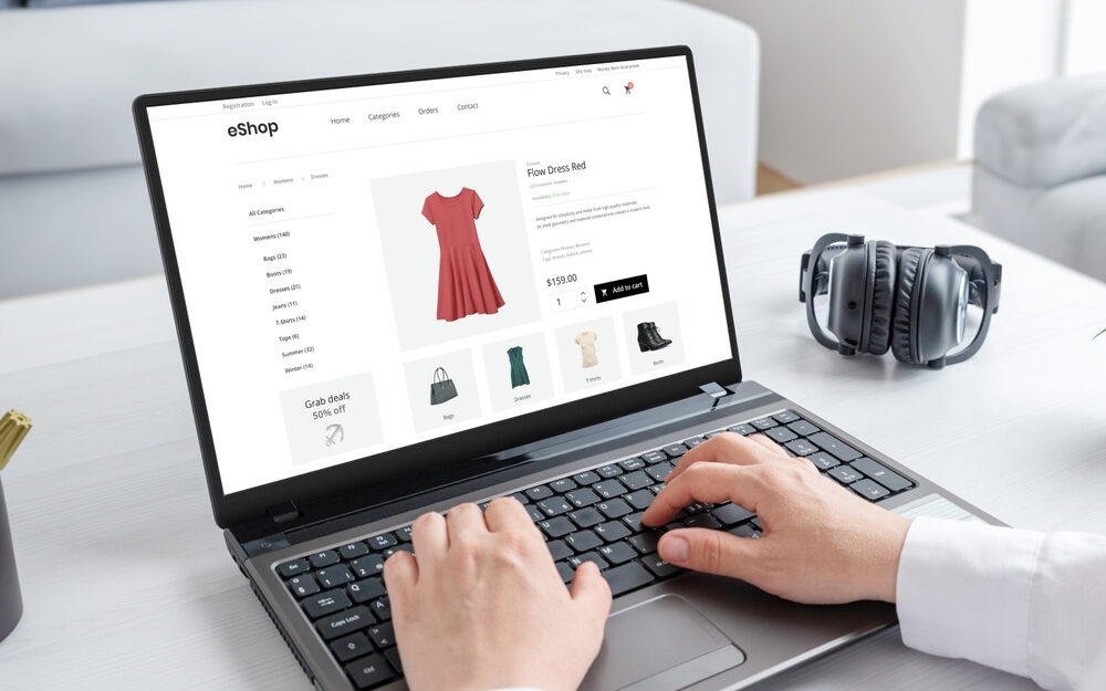
Welcome to the definitive guide on boosting your e-commerce store’s conversion rates. Whether you’re just starting out or looking to refine your approach, this post will provide you with essential strategies to enhance your site’s design, improve user experience, and optimize your calls-to-action to drive sales and growth.
Section 1: Enhancing Website Design
- Simplicity is Key: Streamline your website’s design to facilitate navigation. A clean layout with intuitive navigation helps customers find what they need faster, reducing bounce rates and increasing conversions.
- Responsive Design: Ensure your website is mobile-friendly. With an increasing number of users shopping via mobile devices, a responsive design is crucial to providing a seamless shopping experience across all platforms.
- High-Quality Images and Videos: Utilize high-quality product images and videos. This not only enhances the aesthetic appeal but also helps customers make informed purchasing decisions.
- Loading Speed: Optimize your website’s loading speed. Faster loading times improve user experience and positively impact SEO rankings, which can drive more traffic to your site.
- Speed Testing Tools – Use this link to check your website’s speed.
Section 2: Improving User Experience (UX)
- User Feedback: Regularly collect and analyze customer feedback. Use this data to make informed improvements to your website.
- Personalization: Offer personalized experiences based on user behavior and preferences. This can include personalized product recommendations, tailored email marketing, and more.
- Checkout Process: Simplify the checkout process. Reduce the number of steps required to make a purchase, which can decrease cart abandonment rates.
- Live Chat Support: Implement live chat support to help resolve customer issues in real time, thereby increasing the likelihood of conversions.
- Hotjar – A tool for understanding your web and mobile site visitors, perfect for improving UX.
Section 3: Implementing Effective Calls-to-Action
- Visibility and Contrast: Ensure that your calls-to-action (CTAs) are visible and stand out from the rest of your page design. Use colors that contrast well with your site’s color scheme to make them pop.
- Action-Oriented Text: Use compelling, action-oriented text for your CTAs. Phrases like “Buy Now,” “Get Started,” or “Shop Today” can create a sense of urgency and encourage users to take action.
- A/B Testing: Regularly test different versions of your CTAs to see which ones perform the best. This can help you optimize your CTAs based on real user data.
- Optimizely – An experimentation platform to A/B test different elements on your website, including CTAs.
Conclusion:
Optimizing your e-commerce store for better conversion rates involves a strategic blend of enhancing website design, improving user experience, and implementing effective calls-to-action. By following these tips, you can not only increase your sales but also enhance your customer’s shopping experience.
Ready to transform your e-commerce store into a conversion powerhouse? Contact us for expert advice and tailored solutions that drive results.


